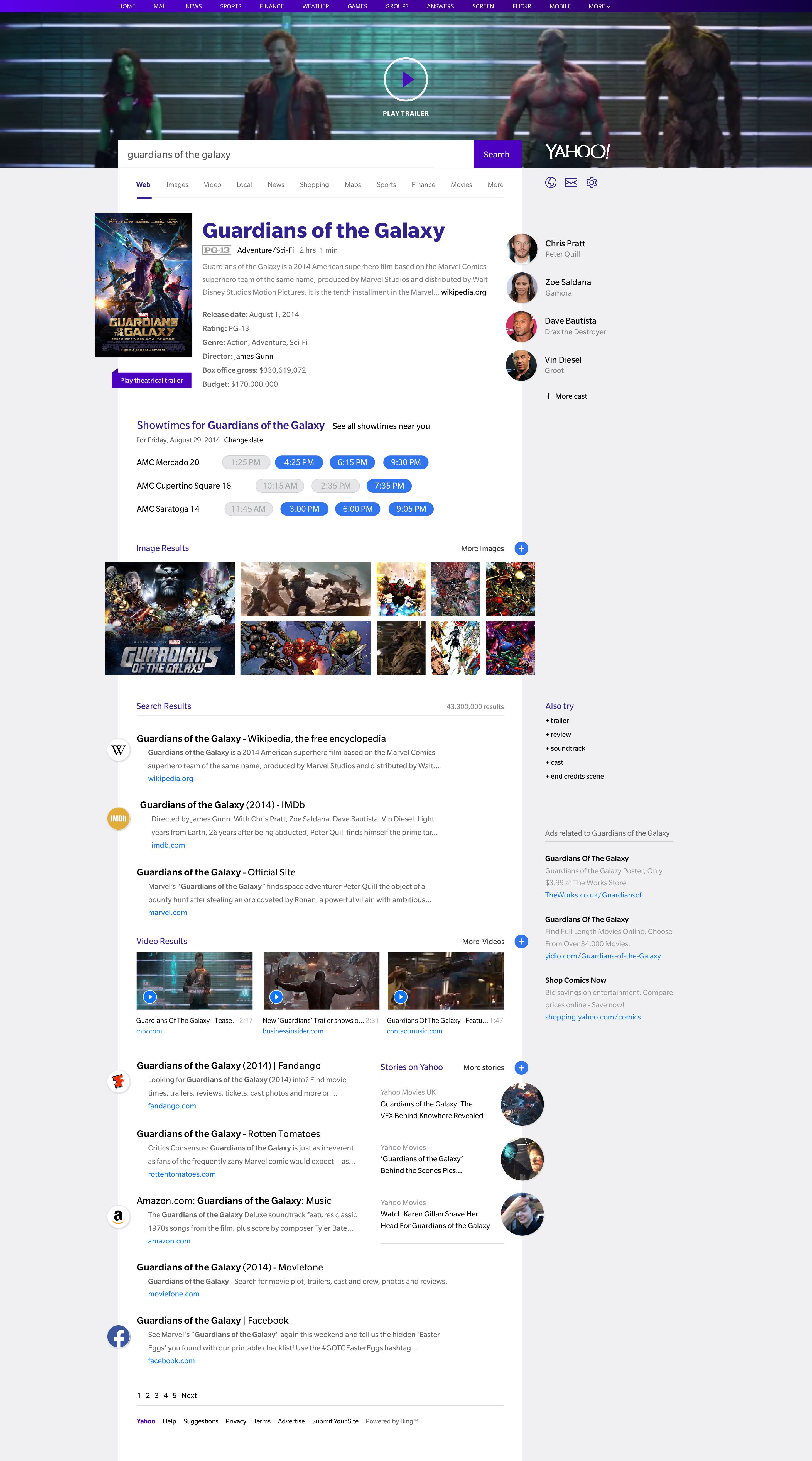
Best directed project ever !
This is the best work I have directed in my entire career and one that I am most proud of ! In Q4 2014, we embarked on an an ambitious project to reimagine Search. The objectives were to solve for the gaps in the current designed which was highly influenced by that of Google’s. Main goal was to improve scanning of content, leverage Yahoo’s strength in head content and differentiate our offerings from Google. This vision helped Yahoo get the mozilla deal. We also used this opportunity to modernize the overall aesthetics, type heirarchy and the underlying grid system.
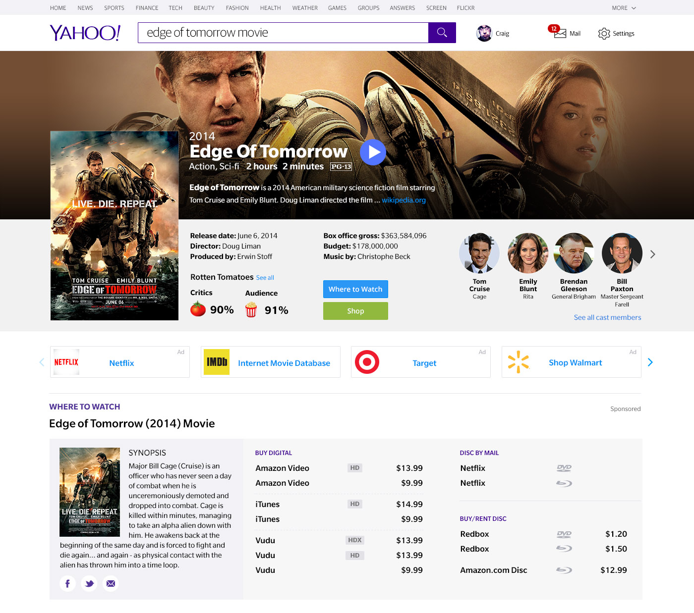
Key issues and problems identified with the current design
1. Right Rail Blindness
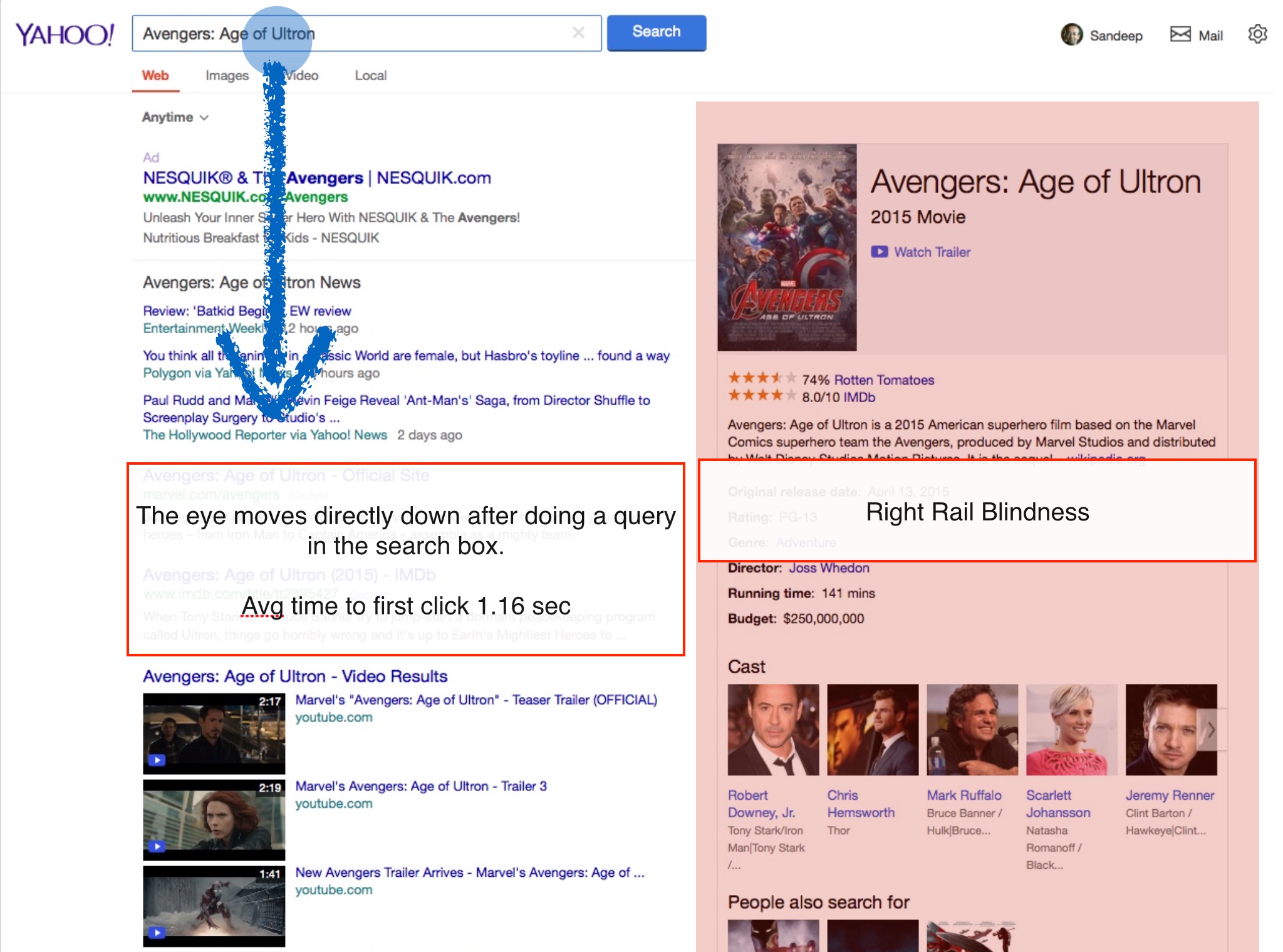
As search moved from showing blue links to showing answers upfront, Google introduced the right rail to show content around the entity being queried.
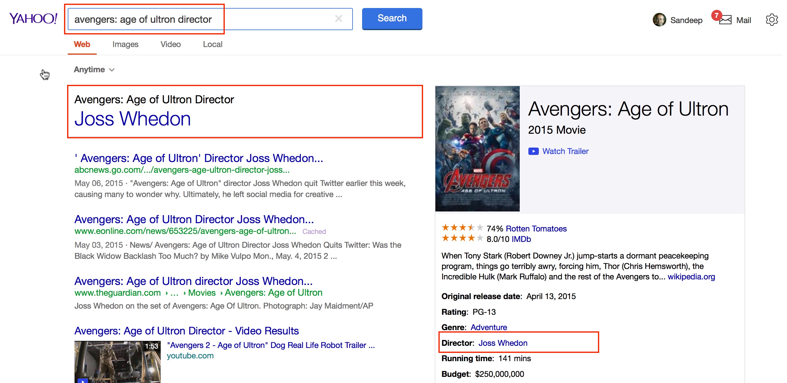
The main problem we noticed with Yahoo users is what we call the "right rail blindness". When the user does a query the eye moves directly down and the right rail is completely ignored. The content they were looking for existed in the right rail but a lot of users did not notice it
2. Right rail not part of slotting algorithm
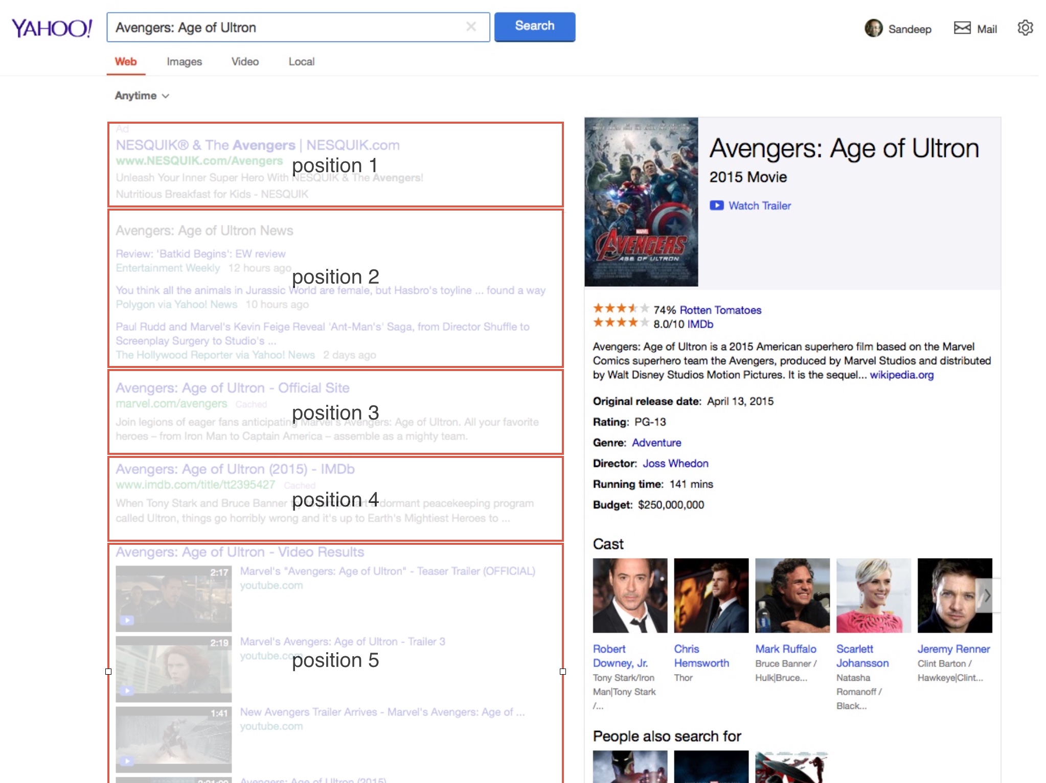
The results and direct display modules in the left rail are triggered and slotted based on relevance and ranking.
The content on the right rail does not participate in this slotting algorithm .
The work around for this is that when the query is an exact match the content is pulled out and repeated on top. e.g Director of Avengers: age of Ultron. See below
3. Left rail under utilized for non Entity queries
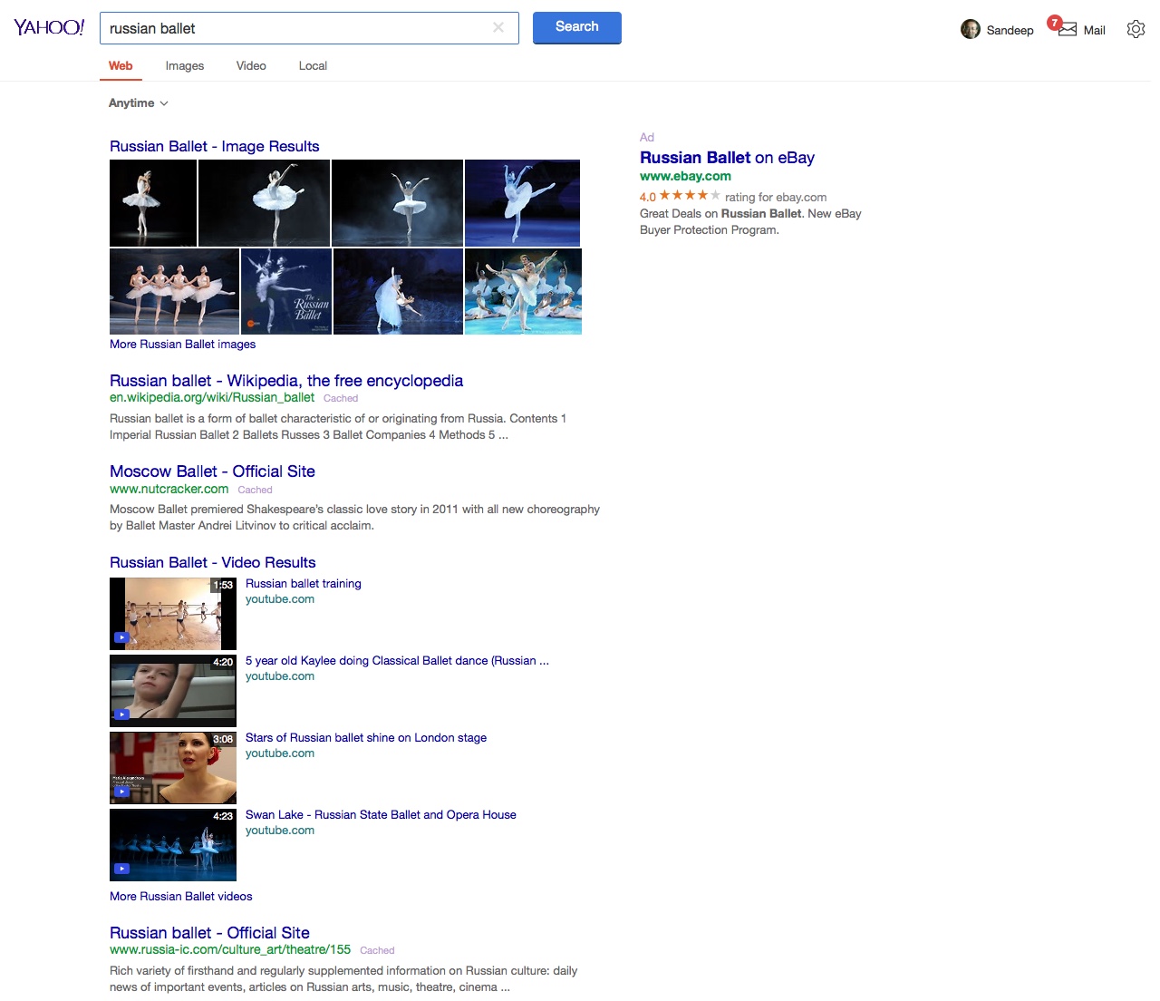
The width of the left rail was traditionally optimized for length of blue links and of course the screen sizes of a decade ago.
Since then the content in the left rail has changed and become richer providing useful information upfront.
This design underutilizes the screen real estate.
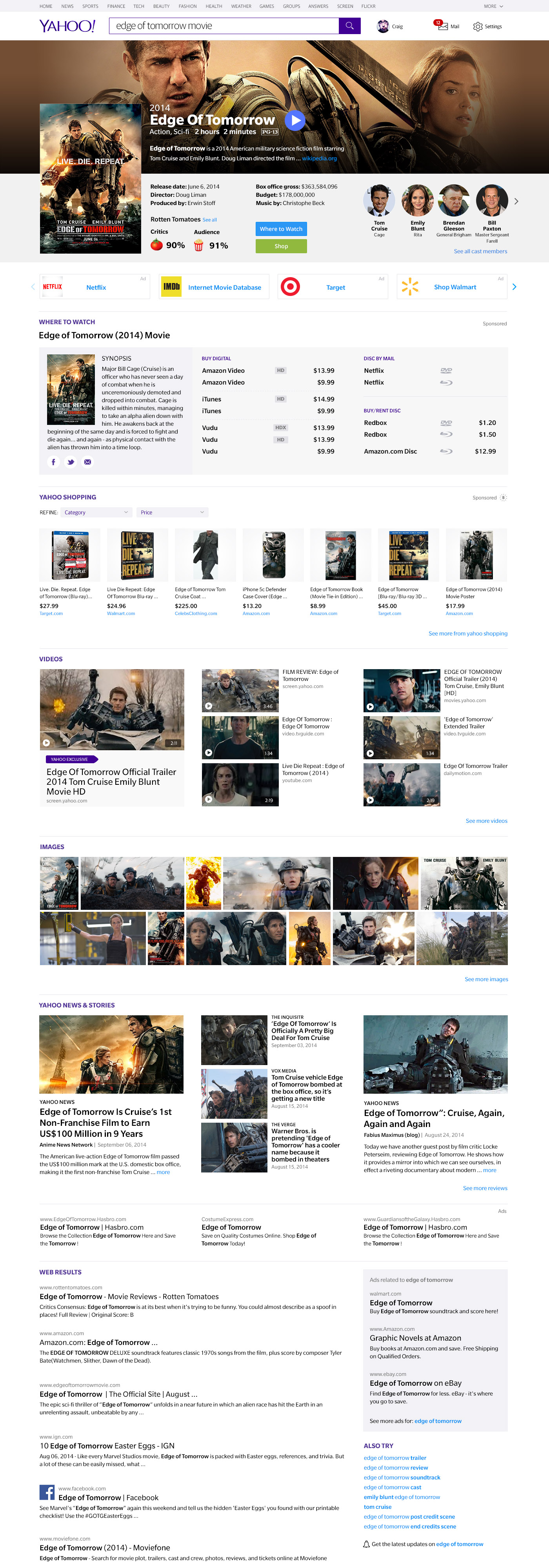
Single wide column concept - Movie not in theatre
Single scan line where algorithmic results and knowledge graph content is slotted in the same column. For head queries with rich content and clear intent. Curated links to top destinations like IMDB, Netflix and Rotten Tomatoes
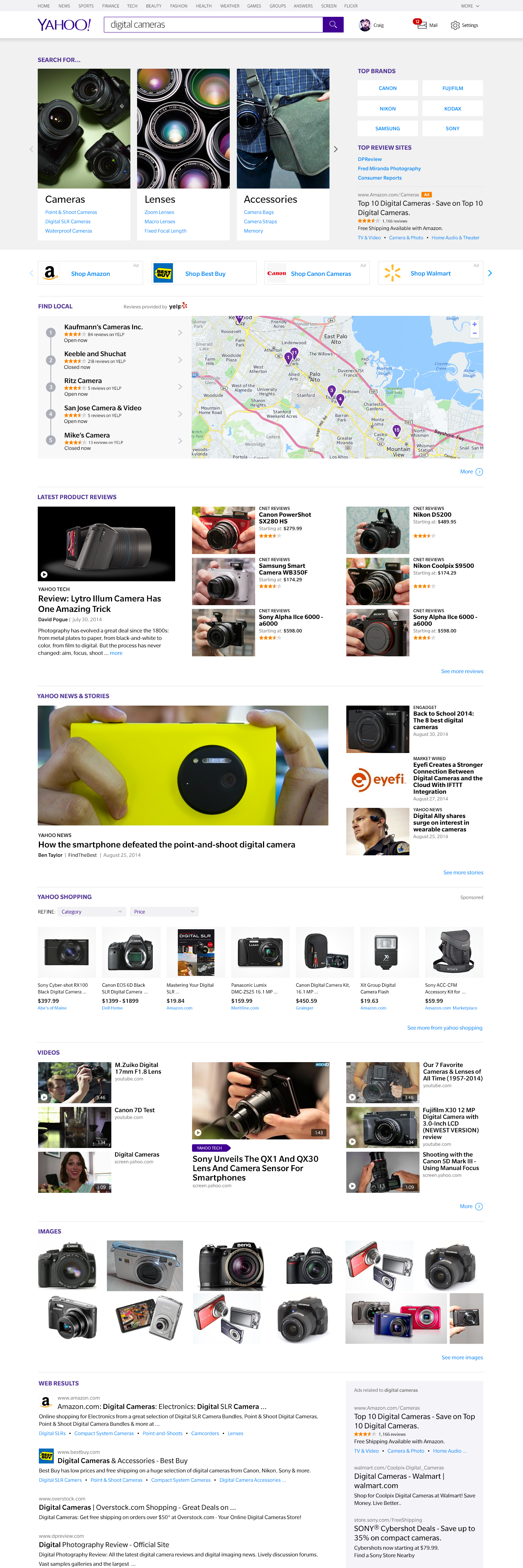
Single wide column concept - Shopping intent
Top module provides a way for query formulation
Single wide column concept - Local search intent
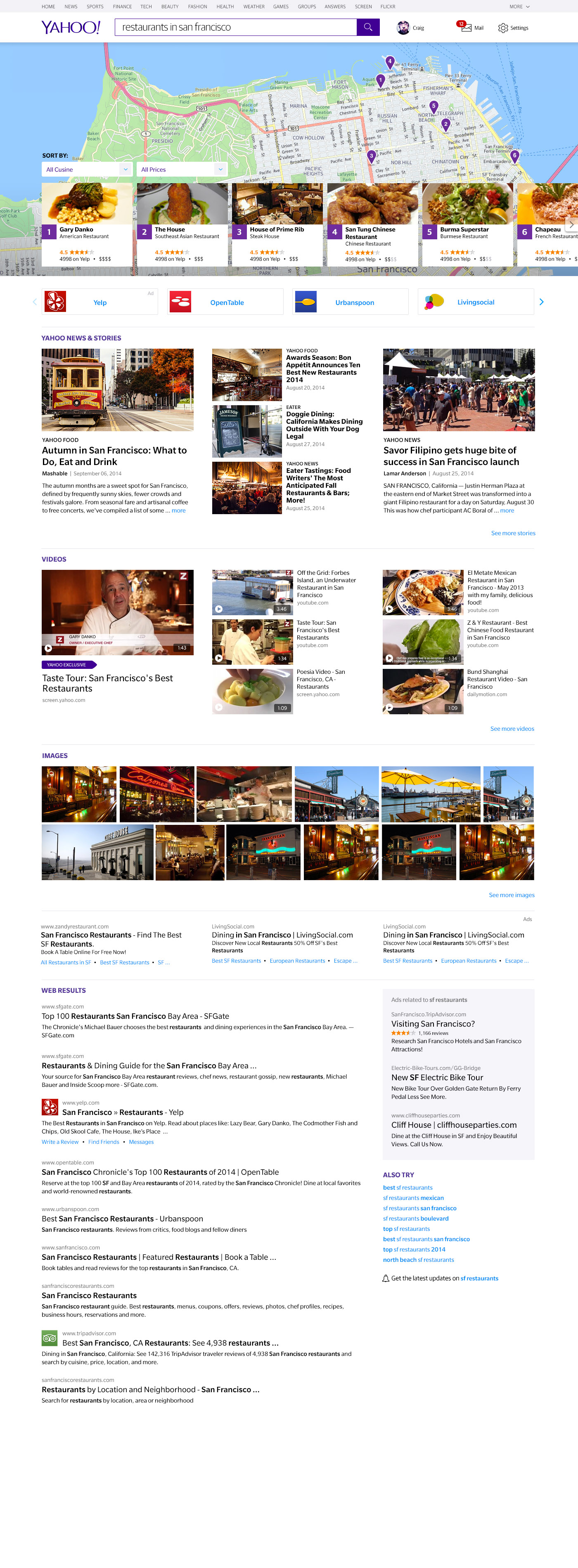
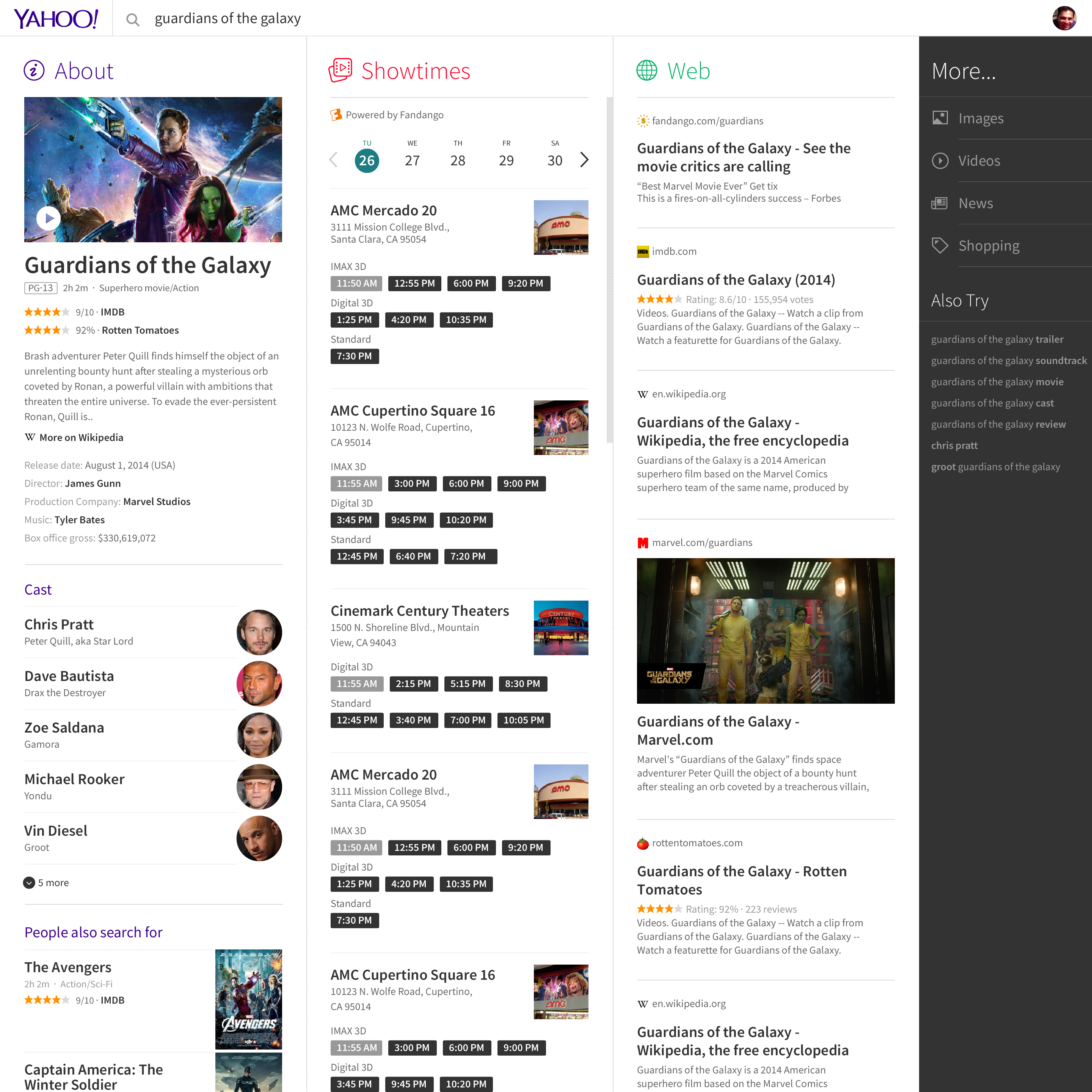
Multi column concept - each mapping to specific intent. Columns move to the left or right depending on user intent
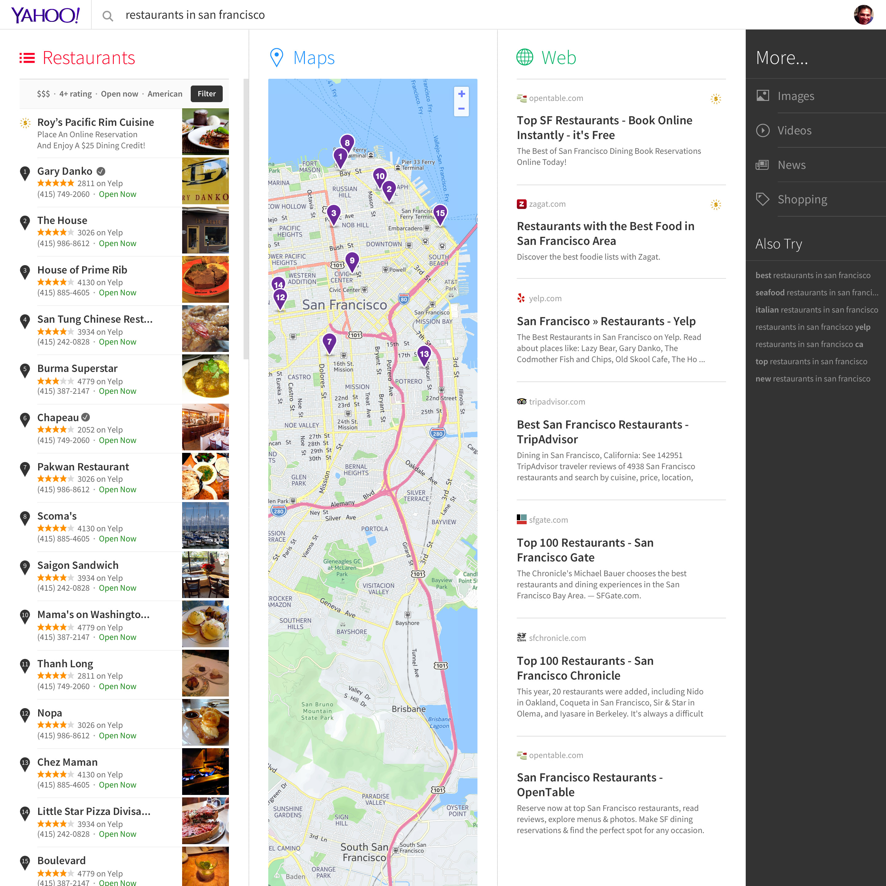
Multi column concept - Local search intent
Concept based on Minimalism - Site Identifier content intentionally breaks the edges to seek attention
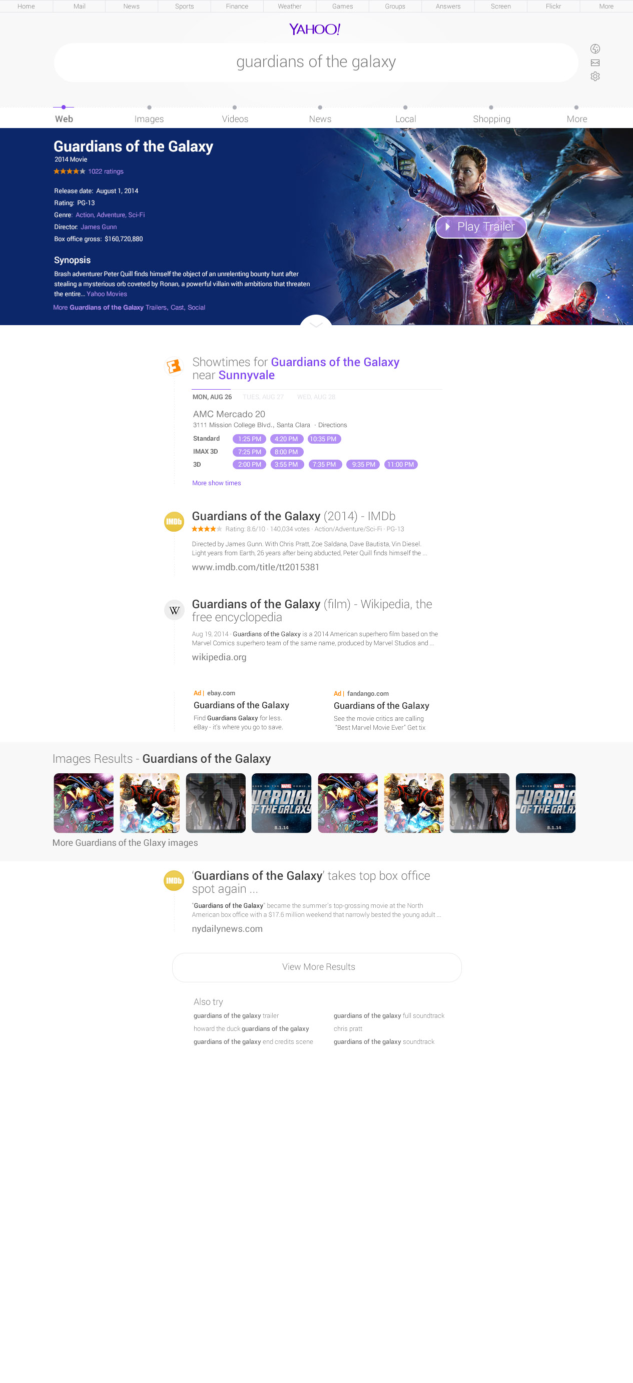
Concept based on Minimalism - Site Identifier content intentionally breaks the edges to seek attention