Yahoo Groups Redesign
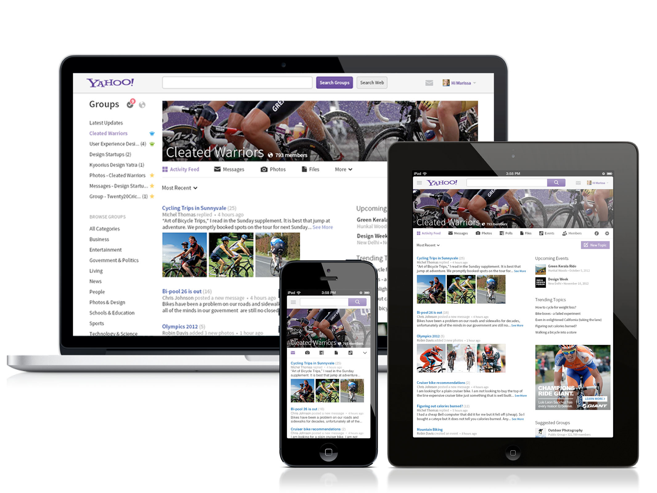
Yahoo Groups is a very sticky product that attracts 2M Daily Avg User’s, 15M PV’s and contributes to 13% of Yahoo mail views. The conceptual design and the experience was not update for more than a decade. An attempt in 2010 was unsuccessful as the users pushed back on any change.
It was however necessary to redesign it to make it attractive to the new users, align to newer ways of communication and enable it across devices.
I drove the redesign effort in 2012. The redesign addressed changing trends in communication, sharing of content and adoption of Mobile. Engaged with Administrators (power users) for over 6 months during the design phase and after launch to understand their requirements and pain points and to make the transiition easier.
Daily active users grew 20%, PVs grew 25%, Mobile share of visits grew from 3% to 30%
Intuitive navigation across 3 screens
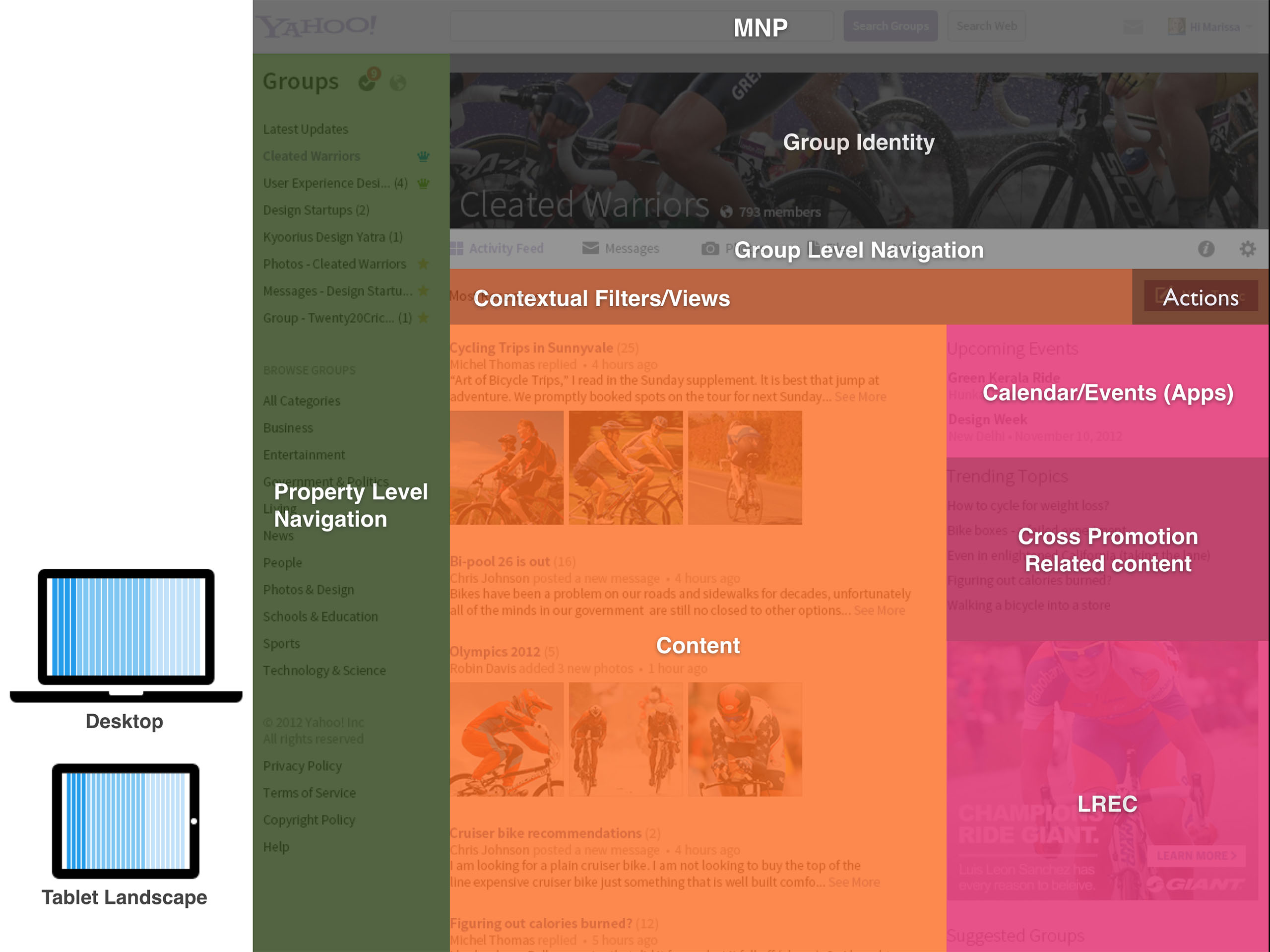
Intuitive navigation to switch between groups and within individual sections of a particular group. The navigation model was designed to adapt and scale to multiple devices.
Tasks are placed contextually for ease of use
recent updates across all groups
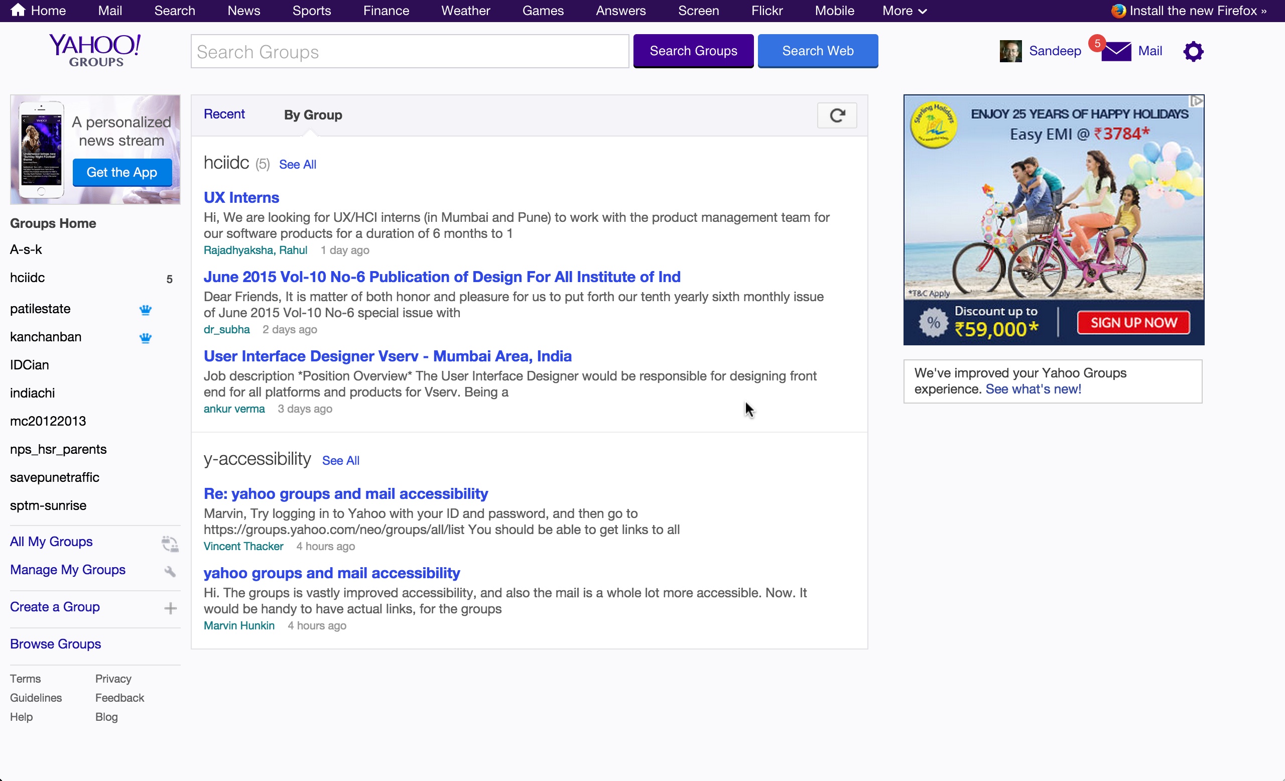
We realized talking to several users that they are subscribed to multiple groups. A routine morning task is to look at updates in each group.
This view lets users see all recent updates across all their groups. Admins can also see a consolidated view of tasks they need to perform to approve new members or new posts.
Group landing page
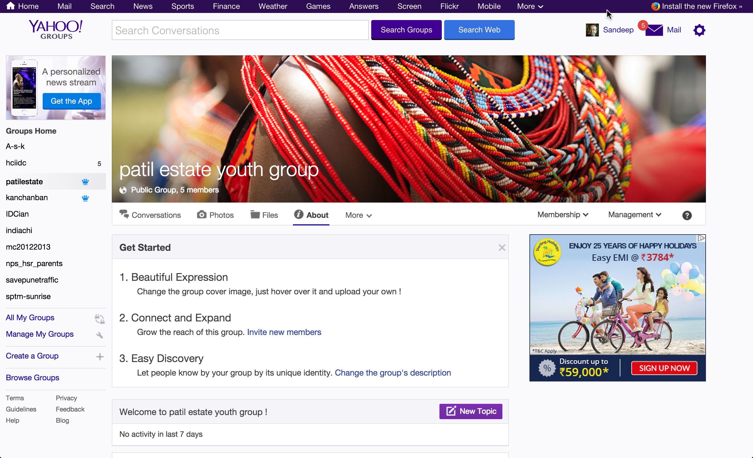
Can be customized by the admin by changing the cover image and the description.
The administrators can use the management dropdown to invoke routing management tasks
Improved photos consumption
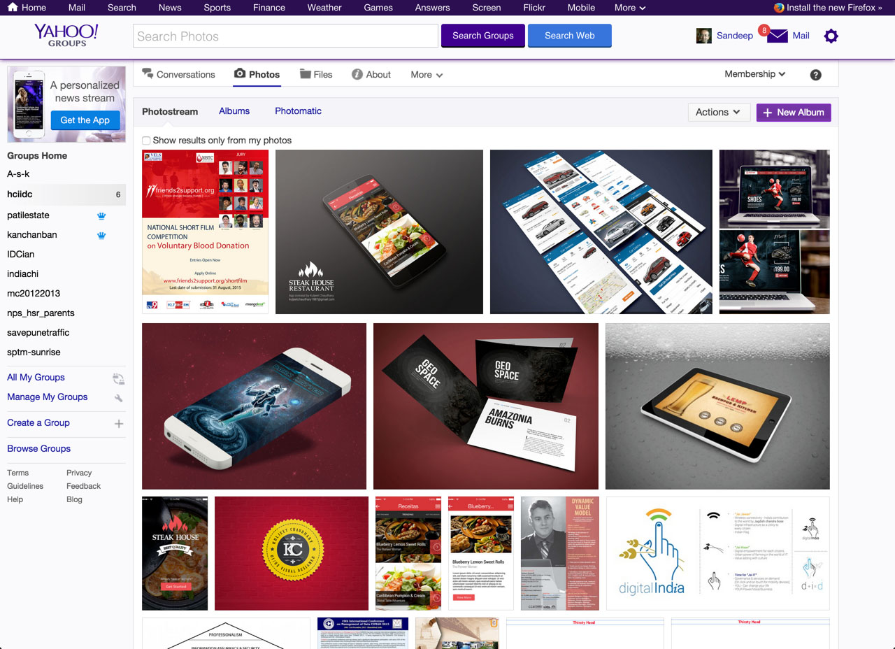
Earlier photos were treated as attachments and there was no easy way to see all photos and images shared in group. Introduced quick commenting to align to new ways of user behaviors
Intelligent threading of conversations
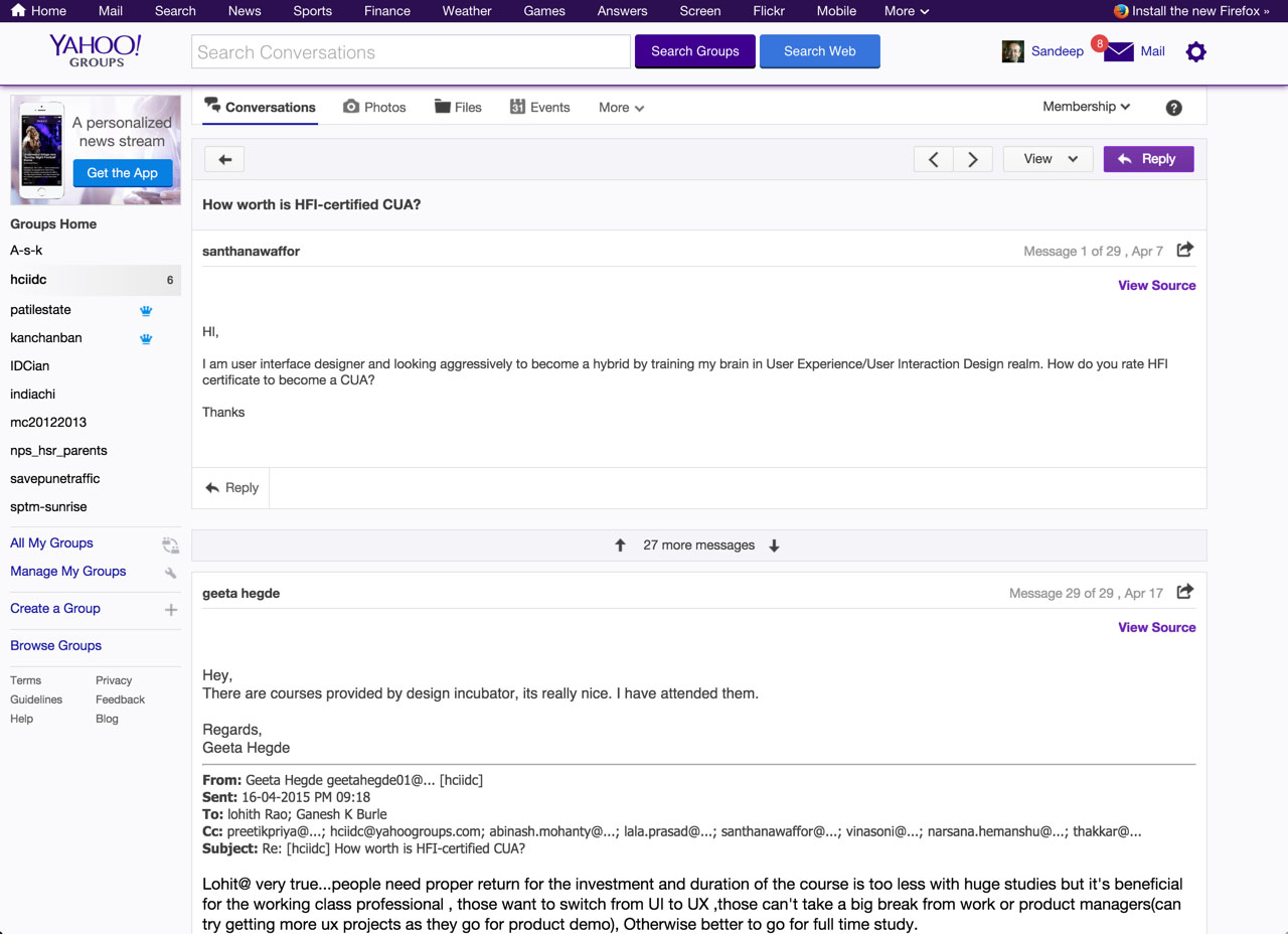
Rules based on number of conversations in a thread. For long threads, first and last messages shown for most recent update and context setting.
Mobile optimized
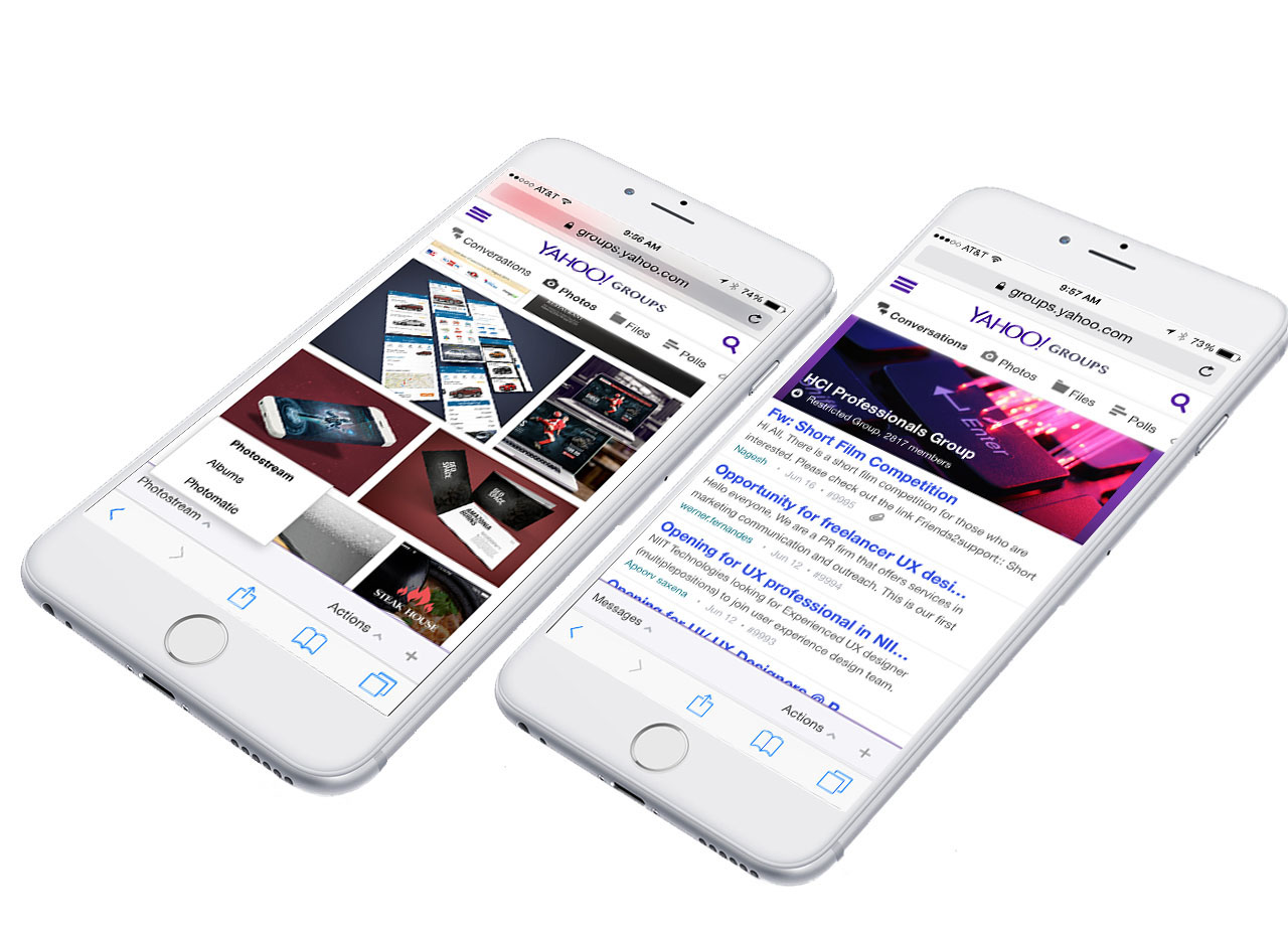
Heavily optimized for mobile consumption.
adaptive across multiple screens
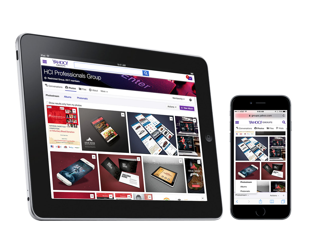
The new design for laying out navigtion, content and tasks , adapts and is intuitive across multiple screens.
A consistent design language
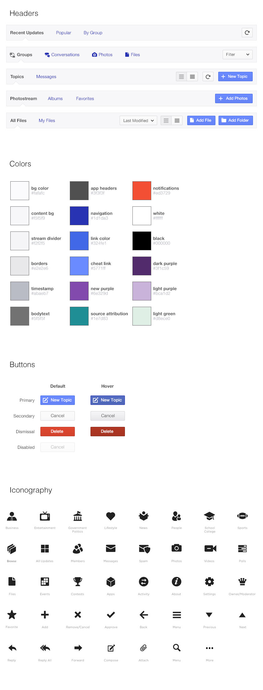
A solid design foundation for a Consistent and modern design language.